In summary, this navigation system project is a celebration of design's ability to seamlessly integrate functionality and aesthetics. The black and gold palette, along with simple shapes, lends an air of sophistication to the pictograms, while the fictional hotel setting showcases how design can elevate the guest experience through imaginative storytelling and visual excellence.
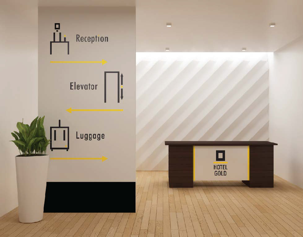
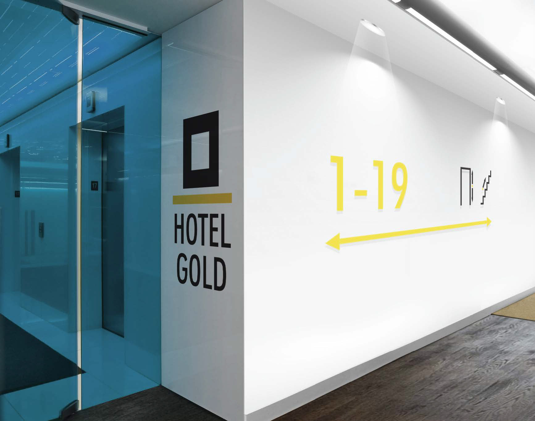
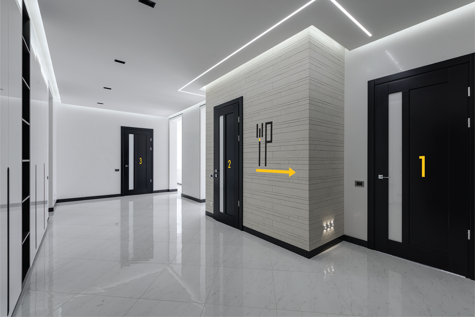
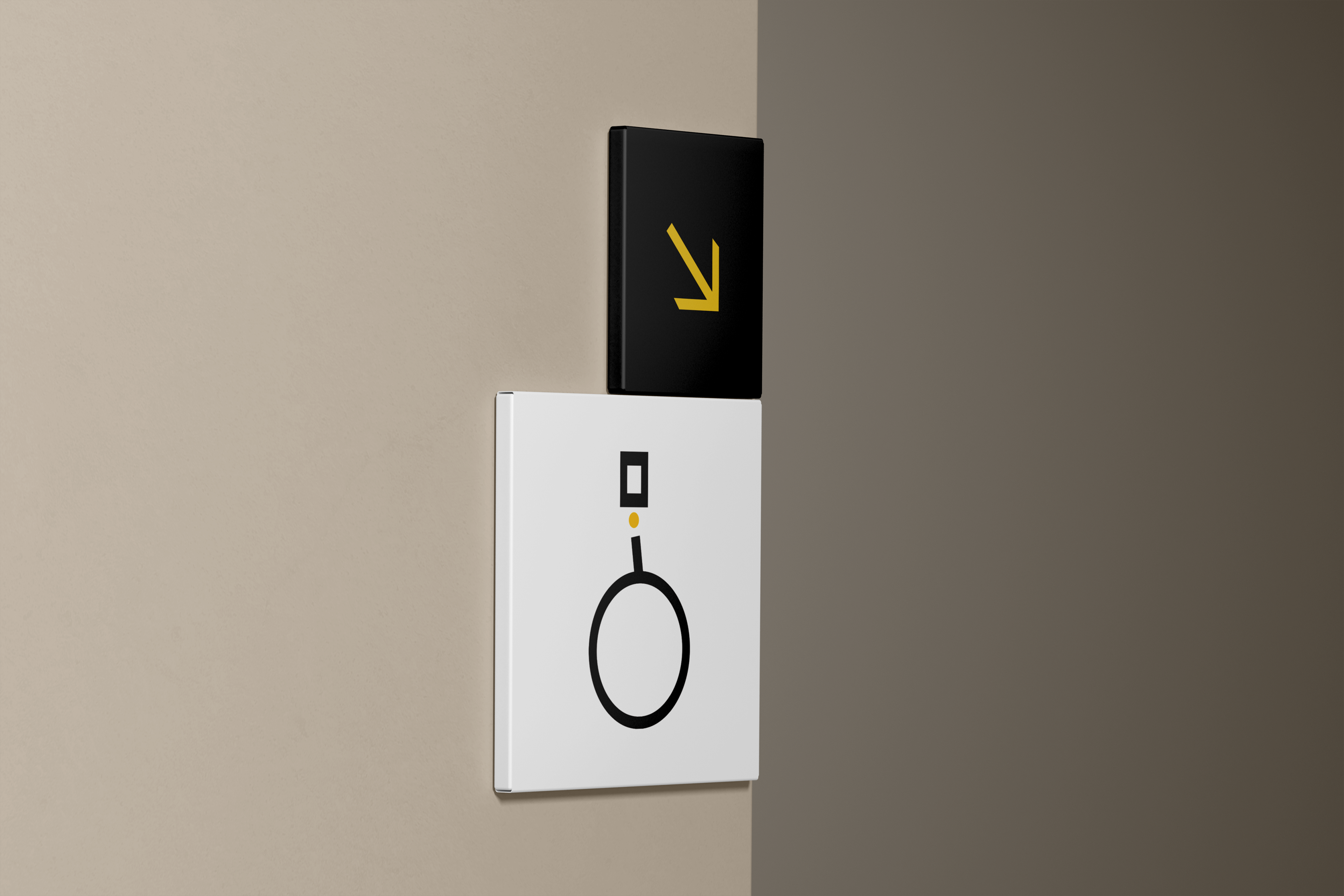
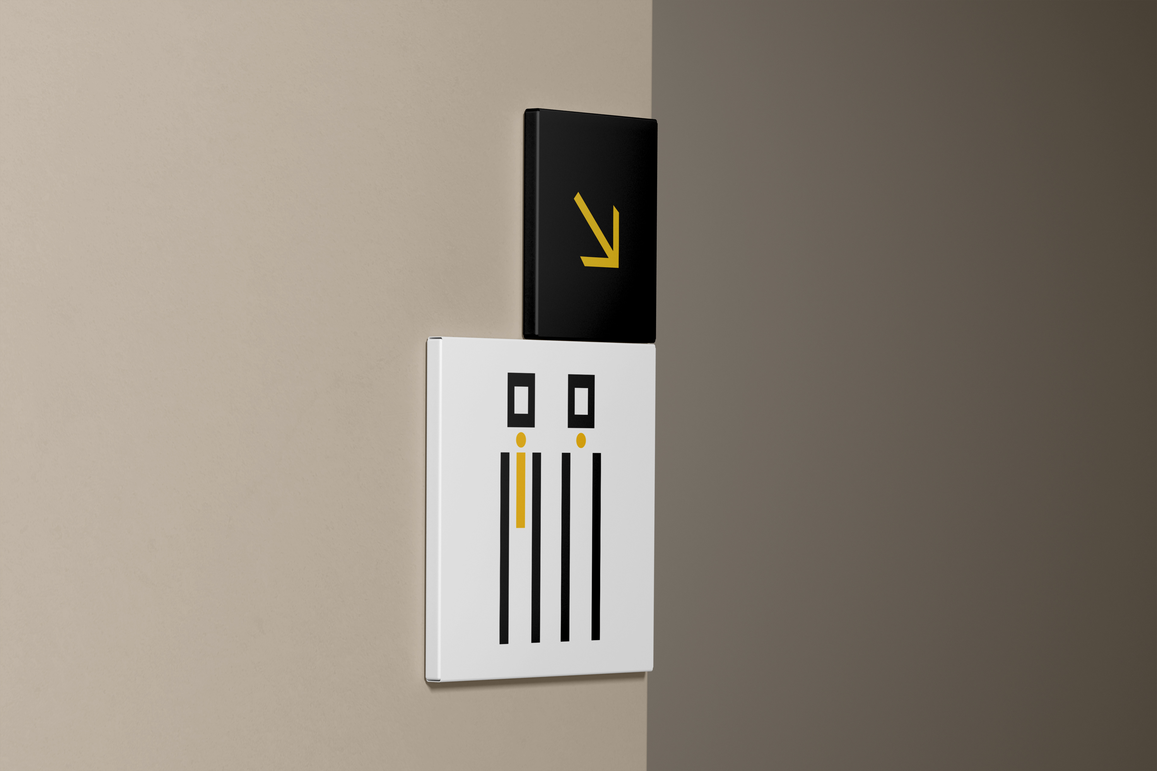
Pictograms, those simple yet powerful visual symbols, are the unsung heroes that guide us through complex environments with ease. In this venture, I delved deep into the art of crafting these symbols, ensuring that they seamlessly communicate essential information to visitors.
To evoke a sense of timeless luxury and sophistication, I chose a color palette that would resonate with elegance. The colors of black and gold took center stage, their combination imbuing the pictograms with a regal aura. The stark contrast between black and gold not only ensured readability but also added a touch of opulence to the navigation system.
In keeping with the philosophy of simplicity and effectiveness, I employed minimalist design principles. Simple shapes formed the foundation of each pictogram, ensuring that the messages they conveyed were universally understood. These shapes transcended language barriers, making navigation effortless and intuitive for guests.