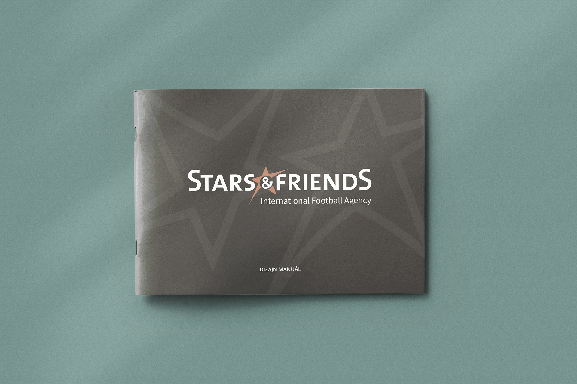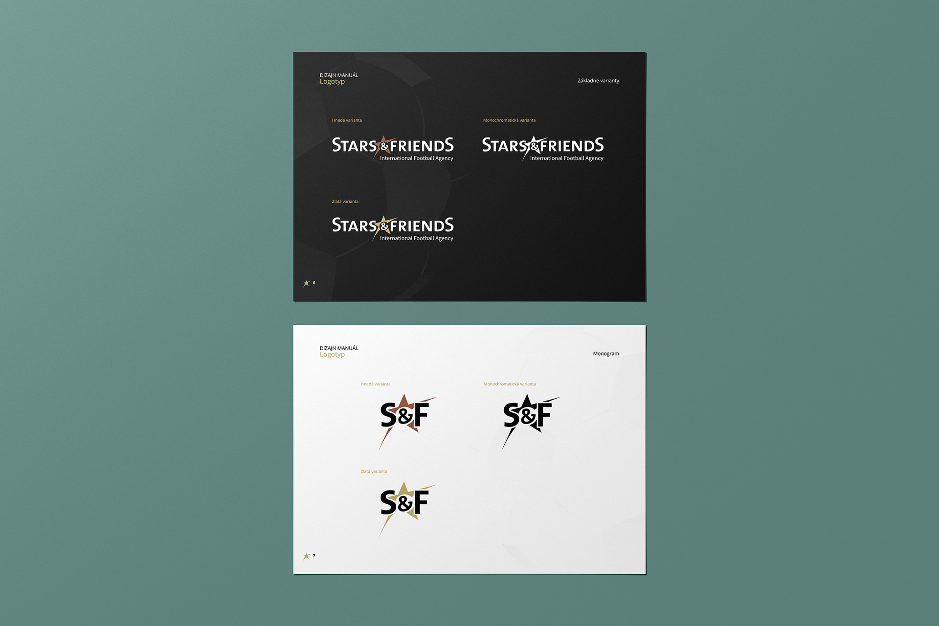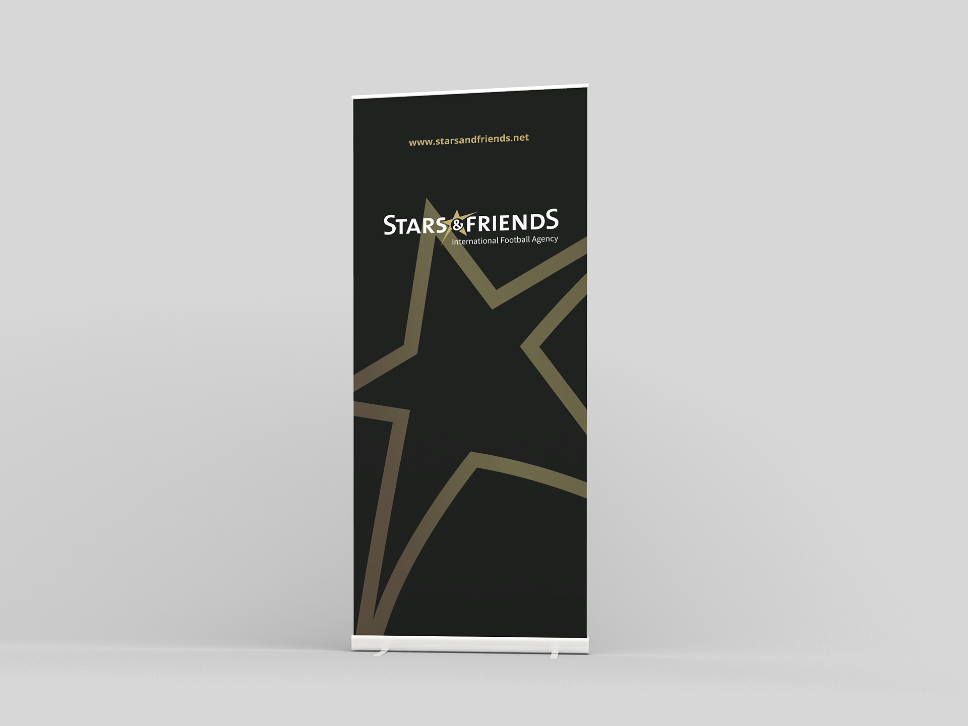
Our endeavor to craft a distinct visual identity for Stars & Friends, a prominent Slovak football agency, was a captivating journey in creativity. The cornerstone of our design philosophy rested upon the harmonious fusion of two opulent colors: gold and black. This combination was carefully chosen to convey a profound sense of professionalism and luxuriousness, mirroring the agency's commitment to excellence within the world of football.
In our design, gold serves as the beacon of aspiration and accomplishment, illustrating Stars & Friends' dedication to nurturing football talent and achieving remarkable milestones. Black, on the other hand, provides a backdrop of sophistication and elegance. It represents authority, prestige, and a sense of refinement.
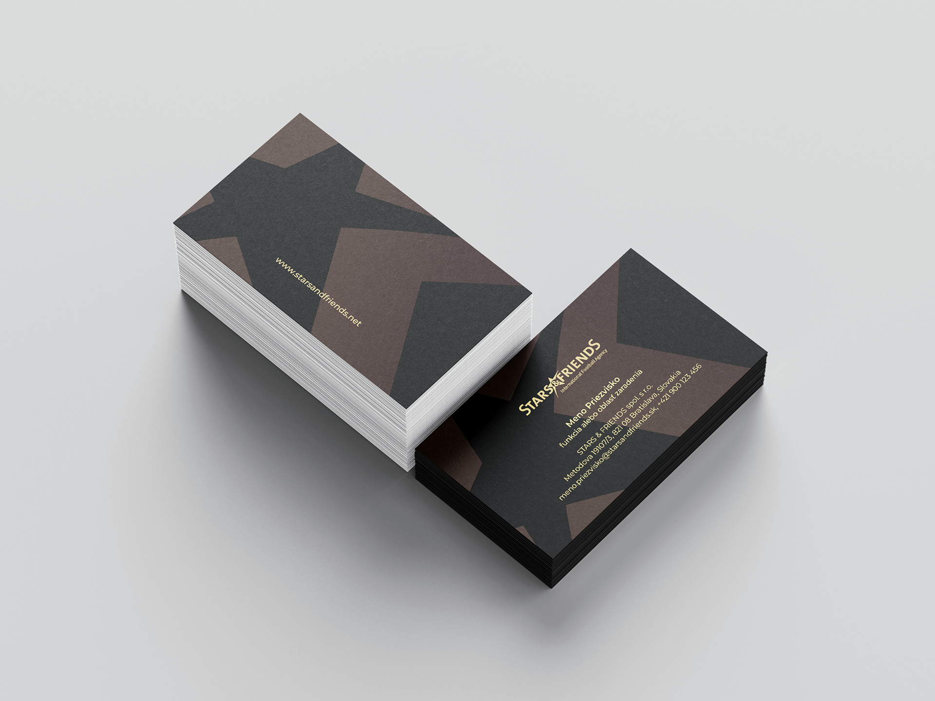
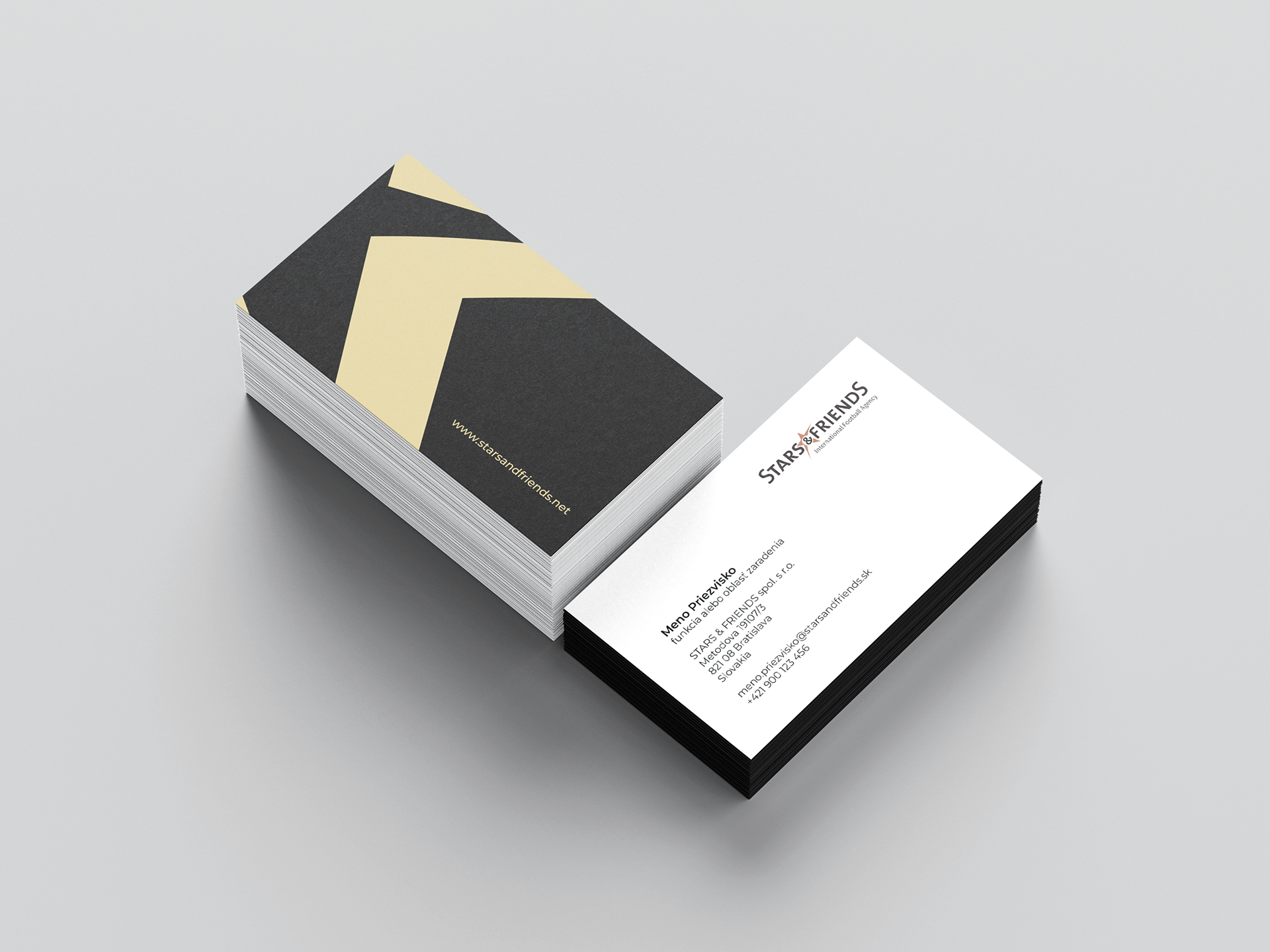
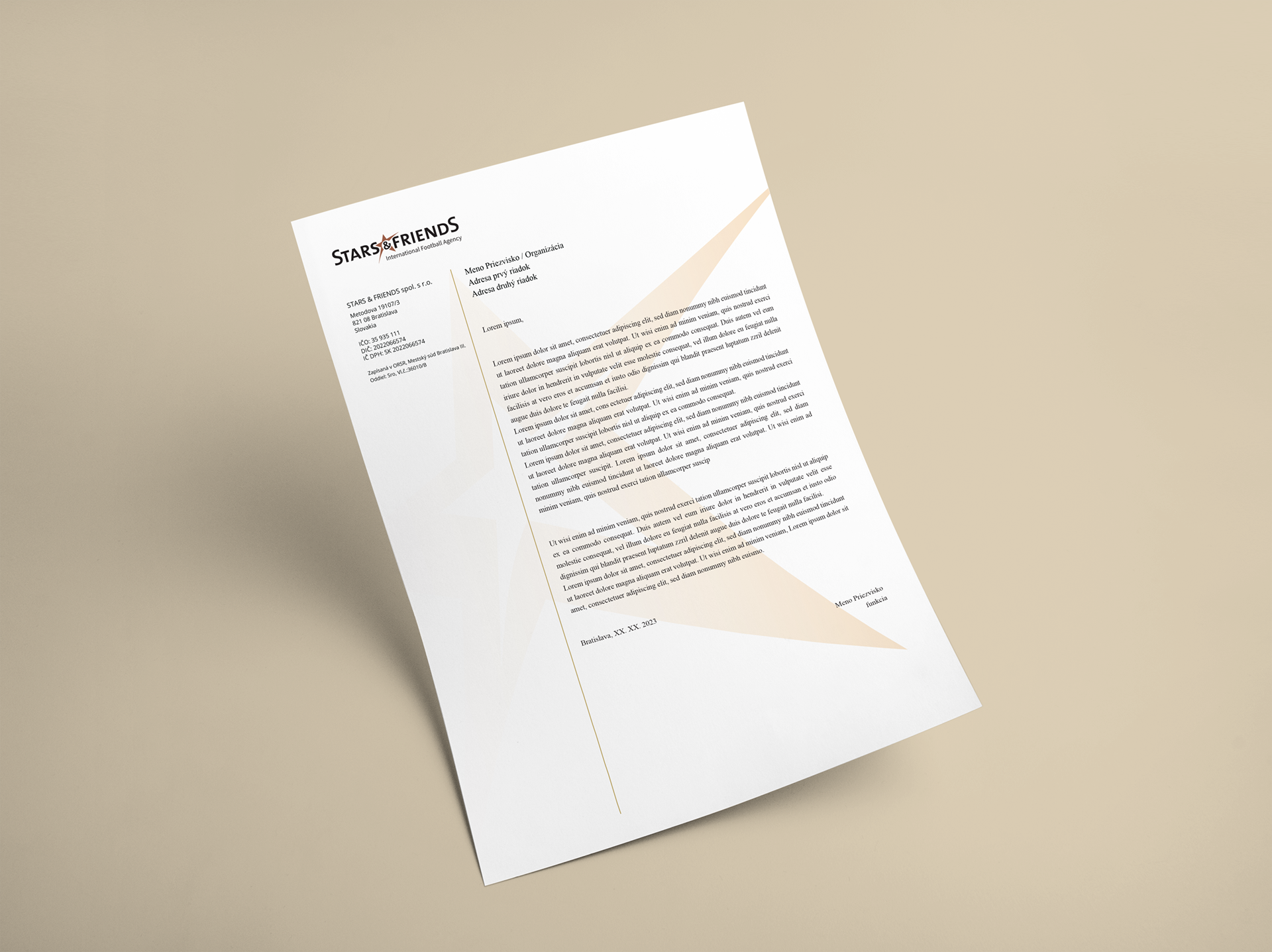
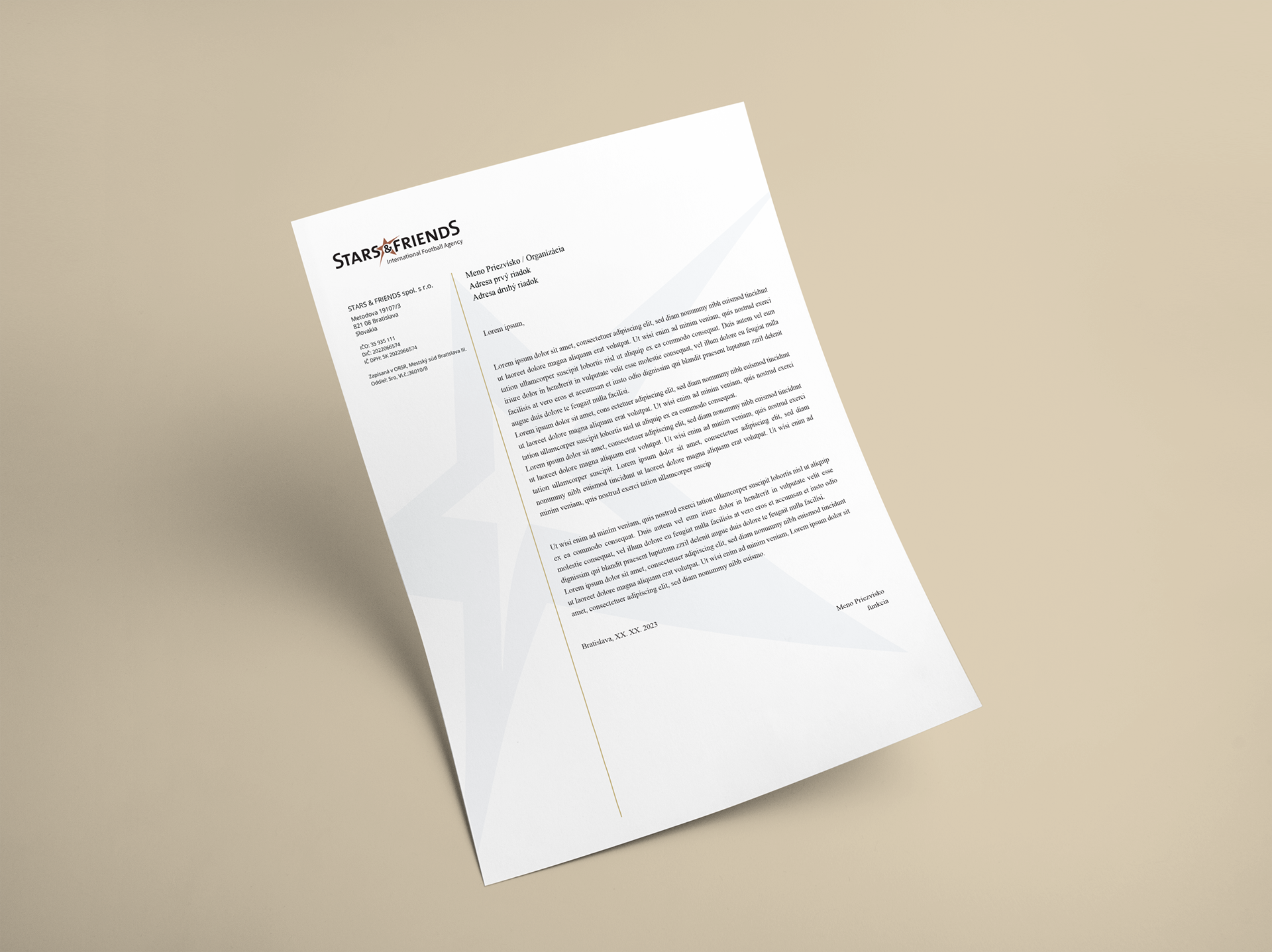
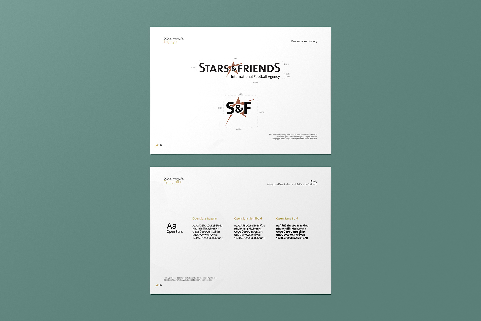
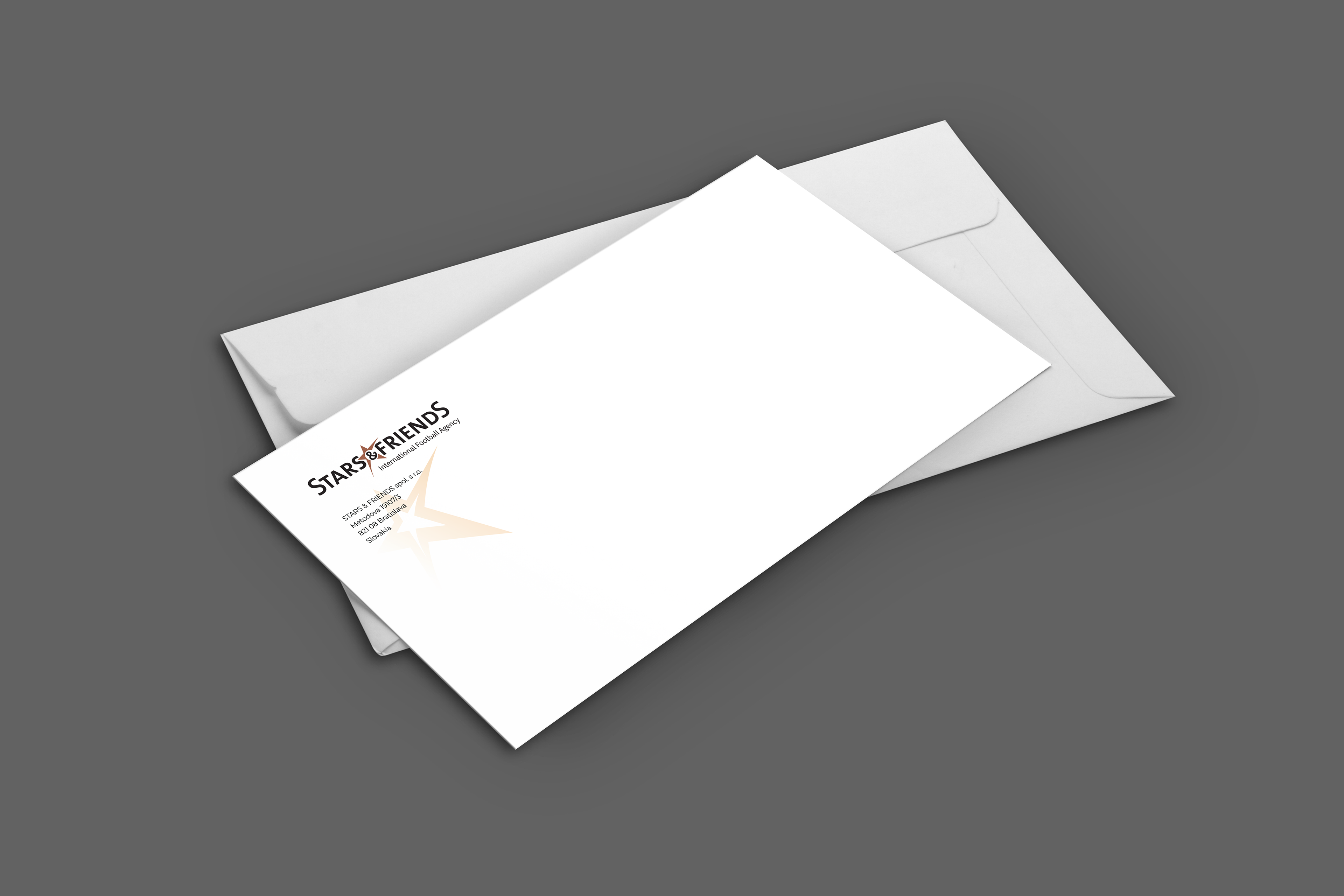
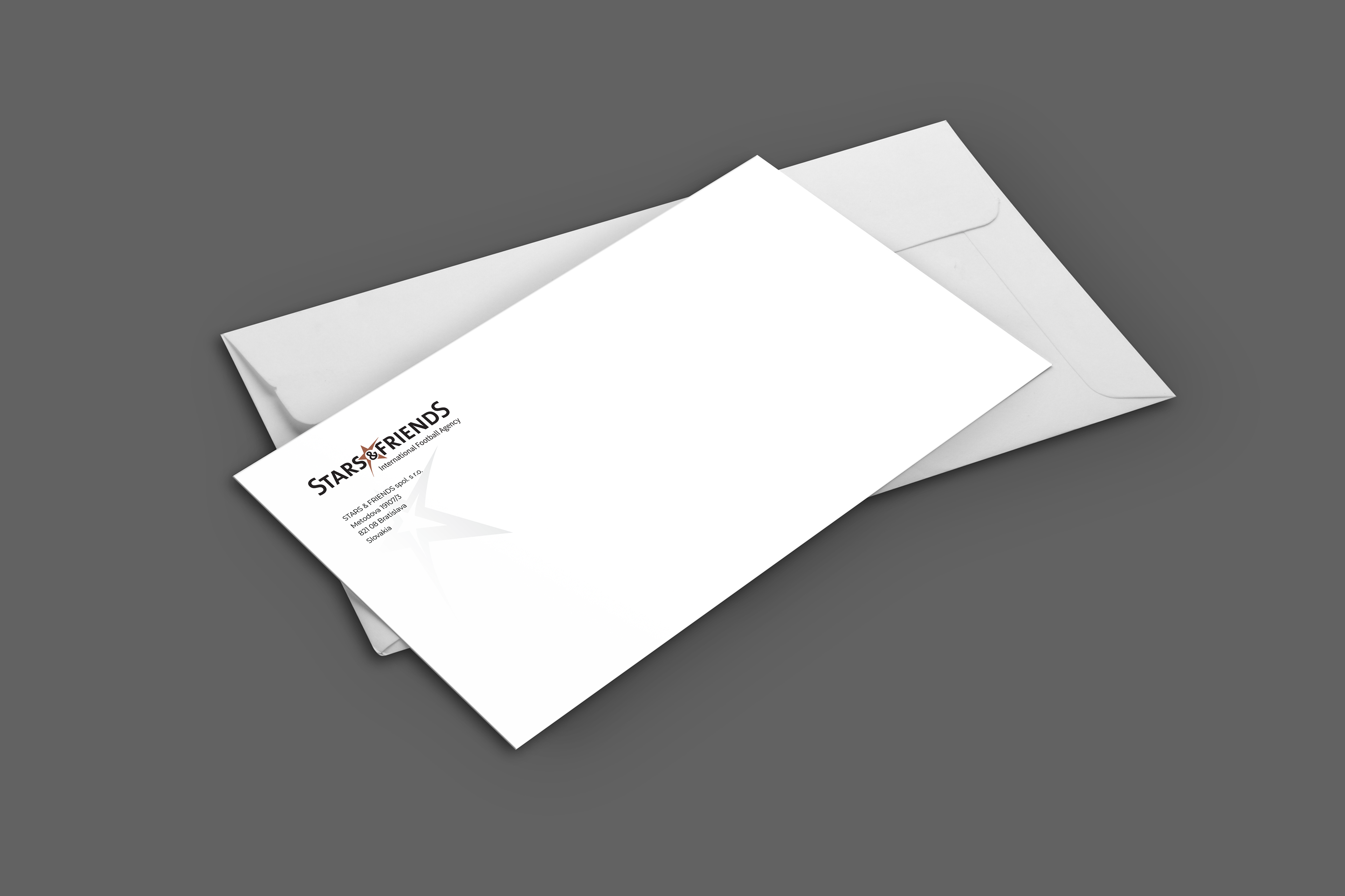
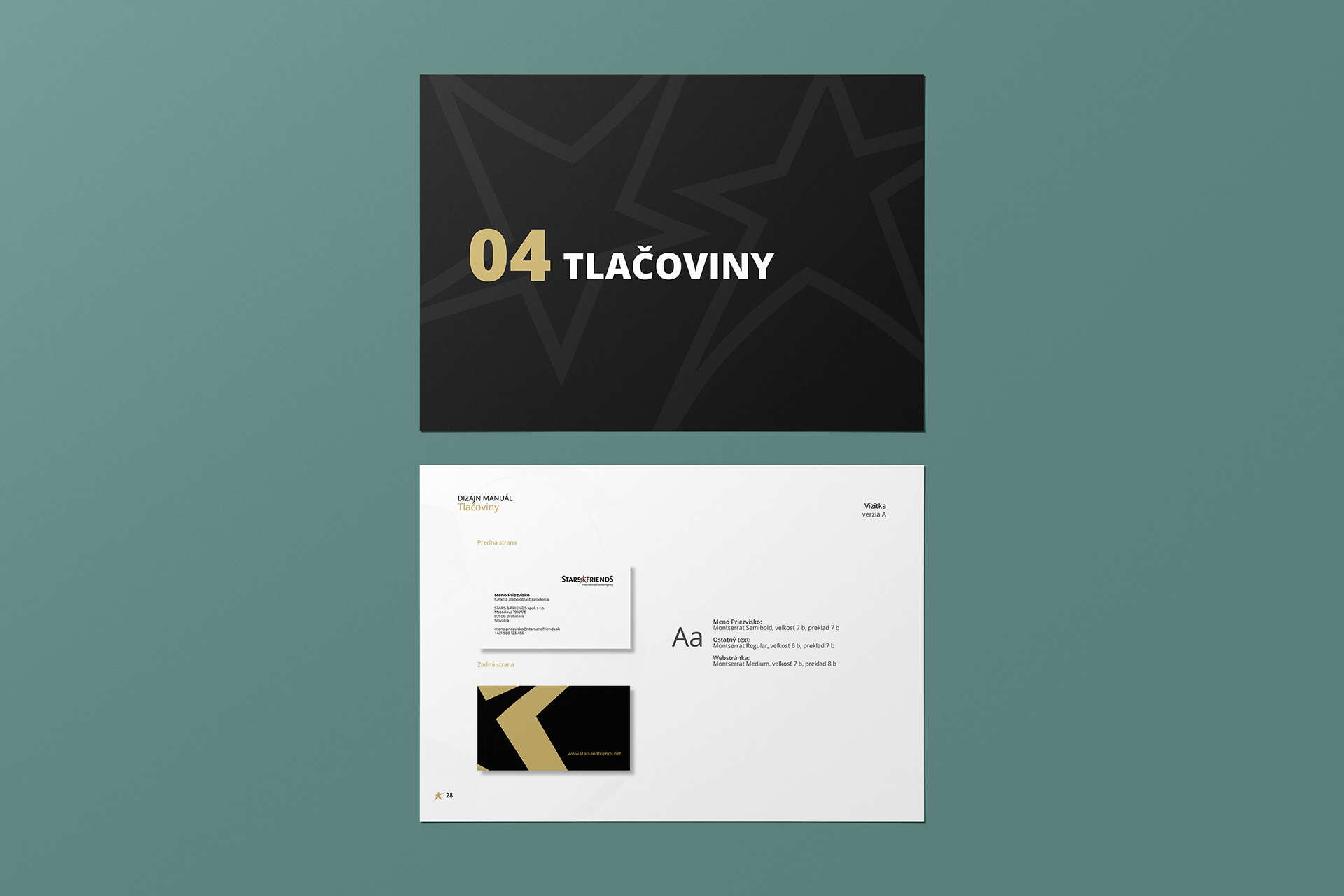
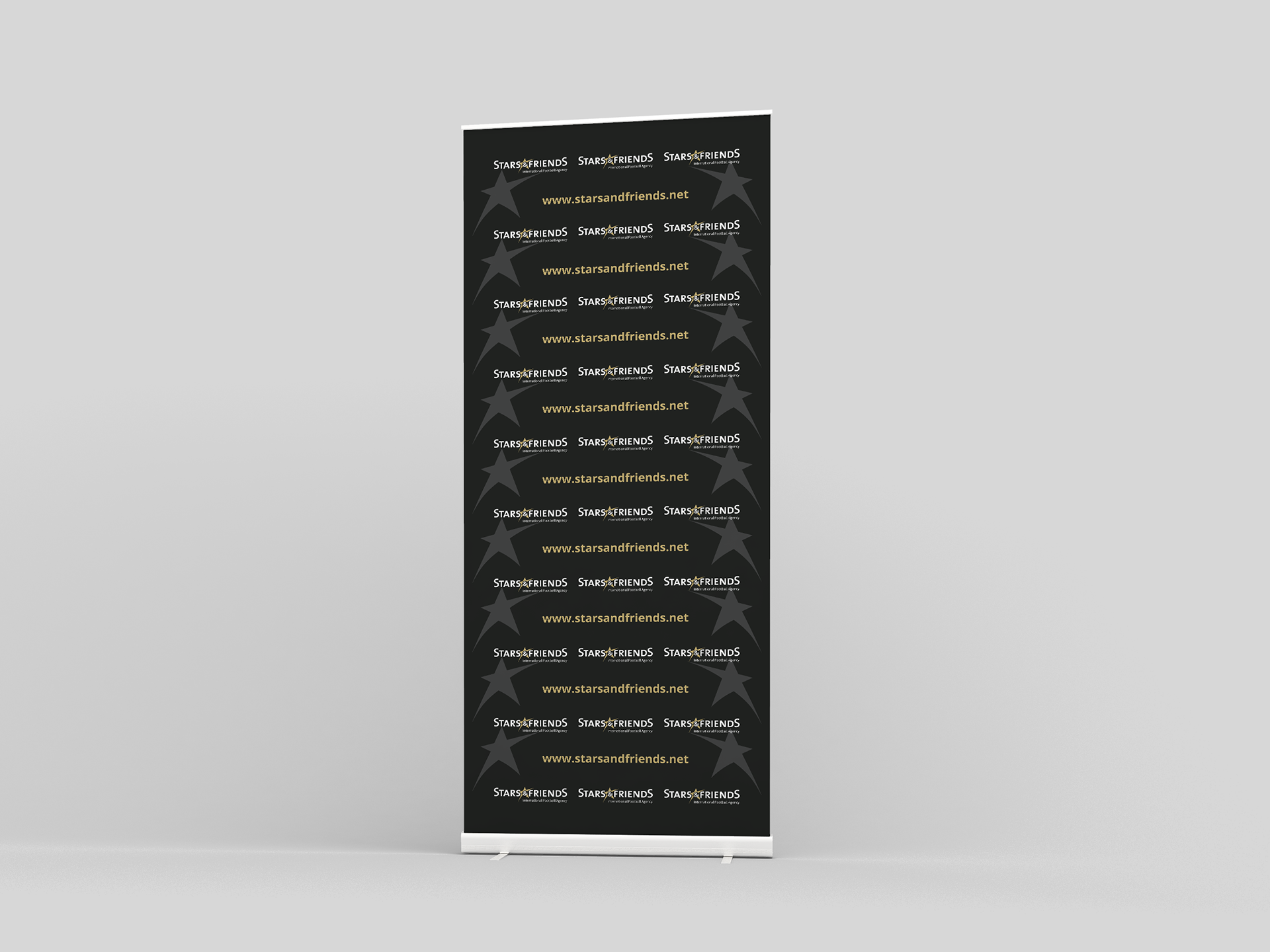
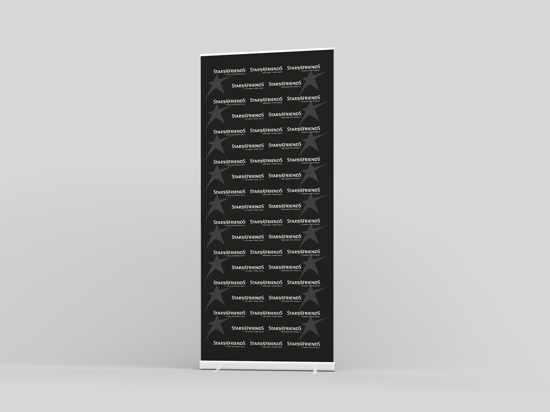
To maintain a unified look across all communication materials, the manual specifies the primary typefaces and their usage, from headings to body text. The manual offers detailed instructions for creating printed materials, such as business cards, letterheads, rollups and more. It covers typography choices, paper quality, and finishes to guarantee a consistent and premium feel across all printed collateral.
With this manual as their guide, Stars & Friends continues to shine brightly in the world of sports, leaving an indelible mark on the hearts of football enthusiasts and industry partners alike.