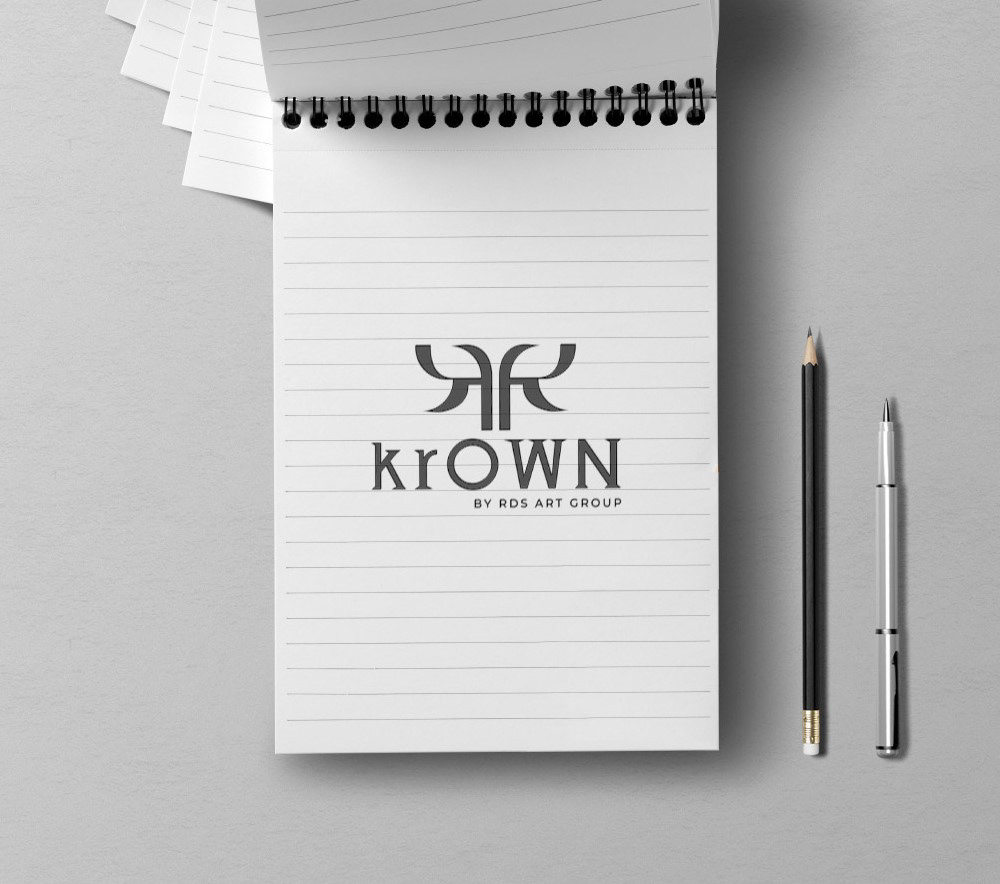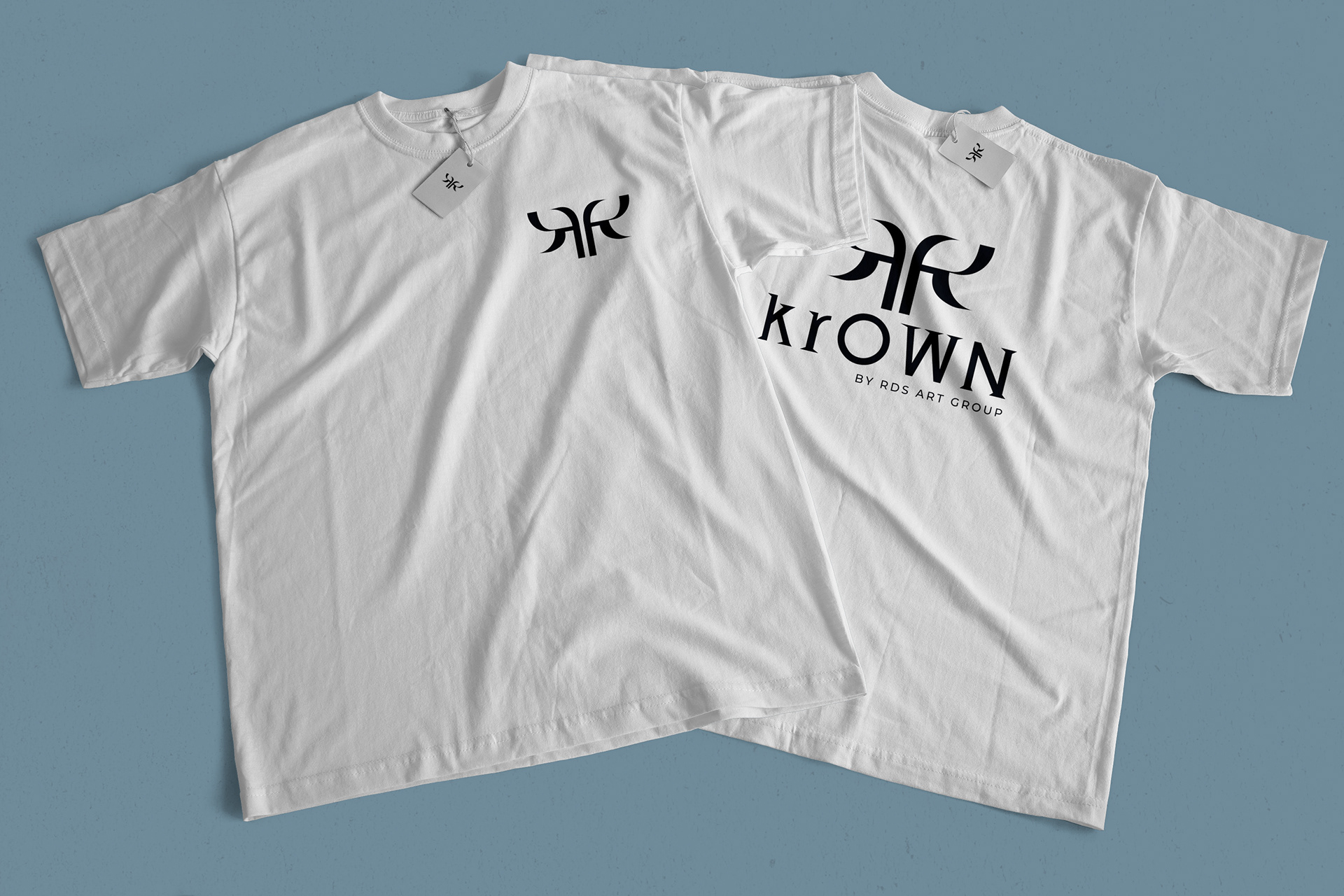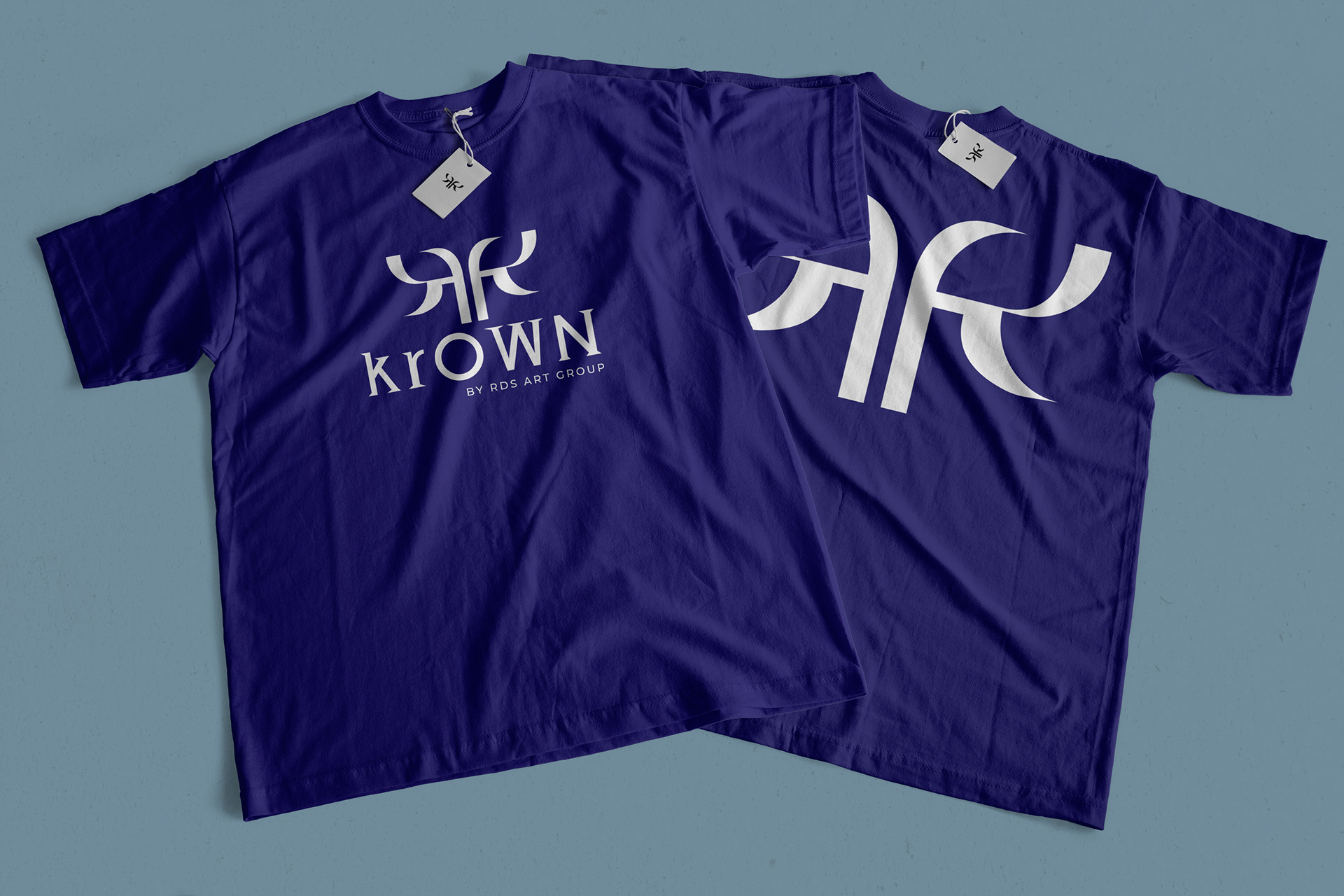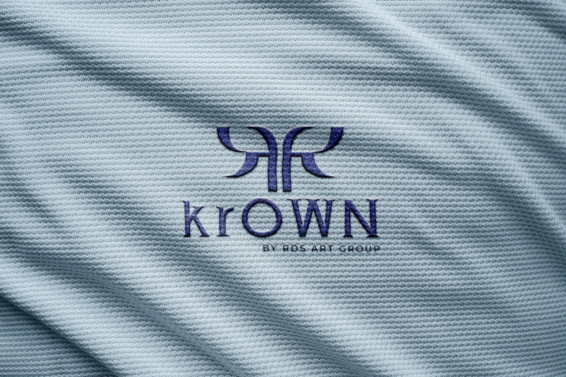
As a graphic designer, I was presented with a thrilling challenge – to create a distinctive logo for "krOWN," the trailblazing K-pop cover group heralding the K-pop wave in Slovakia. The name itself, "krOWN," is a testament to their vision, with 'kr' paying homage to Korea and 'OWN' declaring their unique, self-defined identity.
The heart of the krOWN logo lies in its innovative interpretation of the letter "K." I designed not just one, but two mirrored "Ks" that delicately interlock to create a captivating silhouette. Together, they form an elegant and unmistakable crown, symbolizing the group's aspiration for greatness and their journey to K-pop royalty. The choice of royal blue in the color palette was deliberate – it radiates regal elegance and mirrors the group's desire to shine in the realm of K-pop.
Designing the krOWN logo was a rewarding creative journey. It was about more than just aesthetics; it was about capturing the essence of their pursuit.Witness the rise of krOWN, where my design work merges with their (and mine as well) passion for K-pop. Their journey promises to be as captivating as the music they bring to life.